Cascading Style Sheets (CSS) is a stylesheet language used to describe the presentation of a document written in HTML or XML (including XML dialects such as SVG, MathML or XHTML). CSS describes how elements should be rendered on screen, on paper, in speech, or on other media.
The basic building blocks of CSS are:
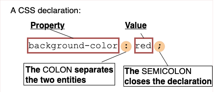
- The property which is an identifier, that is a human-readable name, that defines which feature is considered.
- The value which describe how the feature must be handled by the engine. Each property has a set of valid values, defined by a formal grammar, as well as a semantic meaning, implemented by the browser engine.
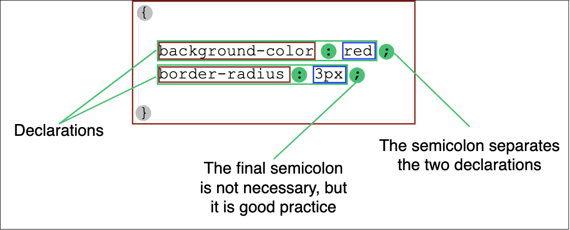
Together, a property and value pair are called a declaration. They are case-insensitive, and are separated by a colon ':'.
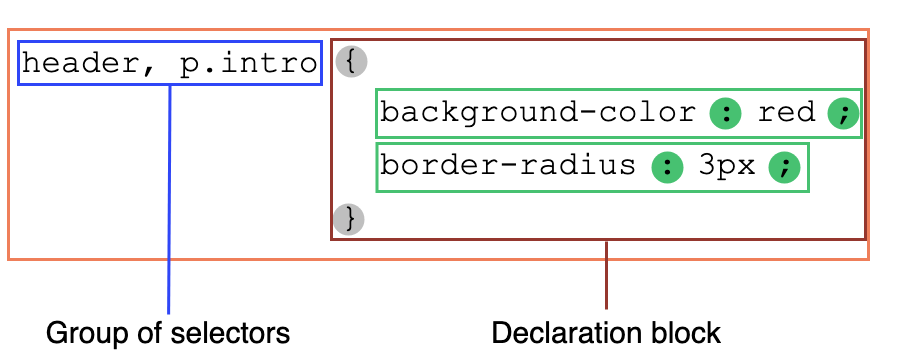
Declarations are grouped in declaration blocks delimited by an opening brace, '{', and a closing one, '}'. Declarations are separated by semi-colons inside these blocks.
Preceeding declaration blocks are selectors, which are conditions selecting some elements of the page. A selector group and an associated declarations block, together, are called a ruleset, or often a rule.
Rulesets are just one kind of statement. The other kind is at-rules. These start with an at sign, '@', followed by an identifier and then continuing up to the end of the statement, that is up to the next semi-colon (;) outside of a block, or the end of the next block. They are used to convey meta-data information (like @charset or @import), conditional information (like @media or @document), or descriptive information (like @font-face).
When laying out a document, the browser's rendering engine represents each element as a rectangular box according to the standard CSS basic box model. CSS determines the size, position, and properties (color, background, border size, etc.) of these boxes.
Every box is composed of four parts (or areas), defined by their respective edges: the content edge, padding edge, border edge, and margin edge.
.png)
Shorthand properties are CSS properties that let you set the values of multiple other CSS properties simultaneously. Using a shorthand property, you can write more concise (and often more readable) style sheets, saving time and energy.
The CSS specification defines shorthand properties to group the definition of common properties acting on the same theme. For instance, the CSS background property is a shorthand property that's able to define the values of background-color, background-image, background-repeat, and background-position. Similarly, the most common font-related properties can be defined using the shorthand font, and the different margins around a box can be defined using the margin shorthand.
A background with the following properties ...
background-color: #000;
      background-image: url(images/bg.gif);
      background-repeat: no-repeat;
      background-position: left top;
... can be shortened to just one declaration:
background: #000 url(images/bg.gif) no-repeat left top;For a font, the following declarations ...
font-style: italic;
      font-weight: bold;
      font-size: .8em;
      line-height: 1.2;
      font-family: Arial, sans-serif;
... can be shortened to the following:
font: italic bold .8em/1.2 Arial, sans-serif;There are many more shorthand properties to make your code more concise. CSS also provides a universal shorthand property, all, which applies its value to every property in the document. Its purpose is to change the properties' inheritance model.
CSS Flexible Box Layout is a module of CSS that defines a CSS box model optimized for user interface design, and the layout of items in one dimension. In the flex layout model, the children of a flex container can be laid out in any direction, and can “flex” their sizes, either growing to fill unused space or shrinking to avoid overflowing the parent. Both horizontal and vertical alignment of the children can be easily manipulated.
In the following example a container has been set to display: flex, which means that the three child items become flex items. The value of justify-content has been set to space-between in order to space the items out evenly on the main axis. An equal amount of space is placed between each item with the left and right items being flush with the edges of the flex container. You can also see that the items are stretching on the cross axis, due to the default value of align-items being stretch. The items stretch to the height of the flex container, making them each appear as tall as the tallest item.
has
extra
text
HTML
<div class="box">
        <div>One</div>
        <div>Two</div>
        <div>Three
          <br>has
          <br>extra
          <br>text
        </div>
      </div>
CSS
.box {
        display: flex;
        justify-content: space-between;
}CSS Grid Layout excels at dividing a page into major regions or defining the relationship in terms of size, position, and layer, between parts of a control built from HTML primitives.
Like tables, grid layout enables an author to align elements into columns and rows. However, many more layouts are either possible or easier with CSS grid than they were with tables. For example, a grid container's child elements could position themselves so they actually overlap and layer, similar to CSS positioned elements.
The example below shows a three-column track grid with new rows created at a minimum of 100 pixels and a maximum of auto. Items have been placed onto the grid using line-based placement.
HTML
<div class="wrapper">
        <div class="one">One</div>
        <div class="two">Two</div>
        <div class="three">Three</div>
        <div class="four">Four</div>
        <div class="five">Five</div>
        <div class="six">Six</div>
      </div>
CSS
.wrapper {
        display: grid;
        grid-template-columns: repeat(3, 1fr);
        gap: 10px;
        grid-auto-rows: minmax(100px, auto);
      }
      .one {
        grid-column: 1 / 3;
        grid-row: 1;
      }
      .two {
        grid-column: 2 / 4;
        grid-row: 1 / 3;
      }
      .three {
        grid-column: 1;
        grid-row: 2 / 5;
      }
      .four {
        grid-column: 3;
        grid-row: 3;
      }
      .five {
        grid-column: 2;
        grid-row: 4;
      }
      .six {
        grid-column: 3;
        grid-row: 4;
}CSS selectors define the elements to which a set of CSS rules apply. Basic selectors are:
- universal selector
- Selects all elements. Optionally, it may be restricted to a specific namespace or to all namespaces.
- Syntax:
* ns|* *|* - Example:
*will match all the elements of the document. - type selector
- Selects all elements that have the given node name.
- Syntax:
elementname - Example:
inputwill match any<input>element. - class selector
- Selects all elements that have the given class attribute.
- Syntax:
.classname - Example:
.indexwill match any element that has a class of "index". - ID selector
- Selects an element based on the value of its id attribute. There should be only one element with a given ID in a document.
- Syntax:
#idname - Example:
#tocwill match the element that has the ID "toc". - attribute selector
- Selects all elements that have the given attribute.
- Syntax:
[attr] [attr=value] [attr~=value] [attr|=value] [attr^=value] [attr$=value] [attr*=value] - Example:
[autoplay]will match all elements that have the autoplay attribute set (to any value).
Media queries let you adapt your site or app depending on the presence or value of various device characteristics and parameters.
They are a key component of responsive design. For example, a media query can shrink the font size on small devices, increase the padding between paragraphs when a page is viewed in portrait mode, or bump up the size of buttons on touchscreens.
In CSS, use the @media at-rule to conditionally apply part of a style sheet based on the result of a media query. Use @import to conditionally apply an entire style sheet.
The animation property is specified as one or more single animations, separated by commas. Each individual animation is specified as:
- zero or one occurrences of the following values:
<single-animation-iteration-count>- the number of times the animation is played<single-animation-direction>- the direction in which an animation is played<single-animation-fill-mode>- determines how styles should be applied to the animation's target before and after its execution<single-animation-play-state>- determines whether the animation is playing or not- an optional name for the animation, which may be
<none>, a<custom-ident>, or a<string> - zero, one, or two
<time>values
The order of values within each animation definition is important: the first value that can be parsed as a <time> is assigned to the <animation-duration>, and the second one is assigned to <animation-delay>.
The order within each animation definition is also important for distinguishing <animation-name> values from other keywords. When parsed, keywords that are valid for properties other than <animation-name>, and whose values were not found earlier in the shorthand, must be accepted for those properties rather than for <animation-name>. Furthermore, when serialized, default values of other properties must be output in at least the cases necessary to distinguish an <animation-name> that could be a value of another property, and may be output in additional cases.
All text borrowed from the MDN CSS Reference links.